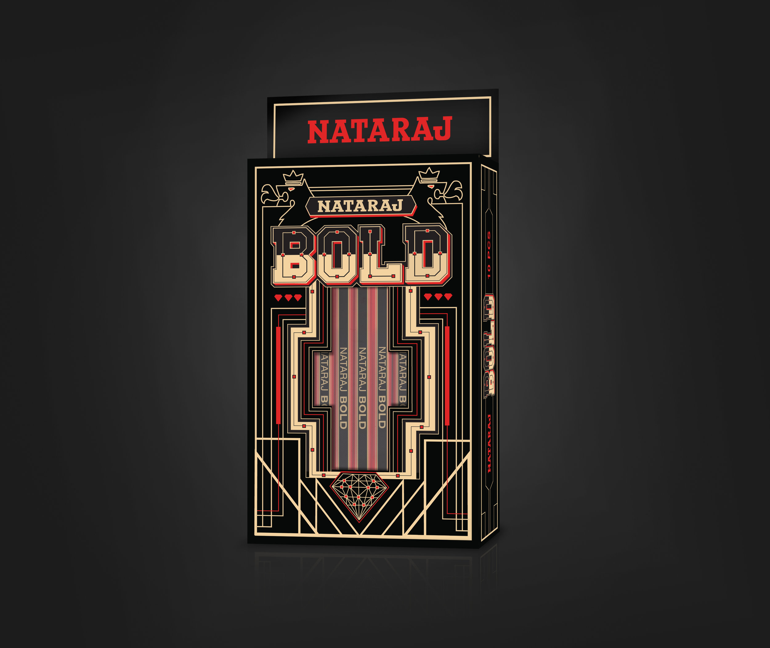
Nataraj Packiging design
Shaping their own pattern.
Nataraj’s unique problem was that all their products were being marketed to both adults and children. We needed to create designs that were attractive to both audiences and still keep the mother brand classy.
So we decided to use shapes and patterns as the fundamental constituent of almost any form of visual art. We incorporate the behaviour of pattern design with seven products.
Packaging design for "Nataraj Pallete". It's a pack of ten in ten colours. The design comes from compostion, colour and expression driven from rhythm and repetition of lines.
Nataraj "Mist" Packaging. Compostion, colour and expression of a vivid dream forms the graphic design for the packaging.
The compostion, colour and expression from the classic / retro nature of the pen and lion used accross bold series. Even the Great Gatsby was proud of it.
Compostion, colour and expression from the classic / retro nature of the pen.


